As a social media manager, I made it a point of emphasis to learn Photoshop to contribute more to the team while working on NFL on Prime. During moments when the team was in a crunch and didn't have a designer, I aimed to be the person who could step up and assist by editing templates for the day-after content. As I became more proficient in Photoshop, I started sending projects to our Art Director to gain a better understanding of what I could work on to become a better designer. The following are examples of those projects. 

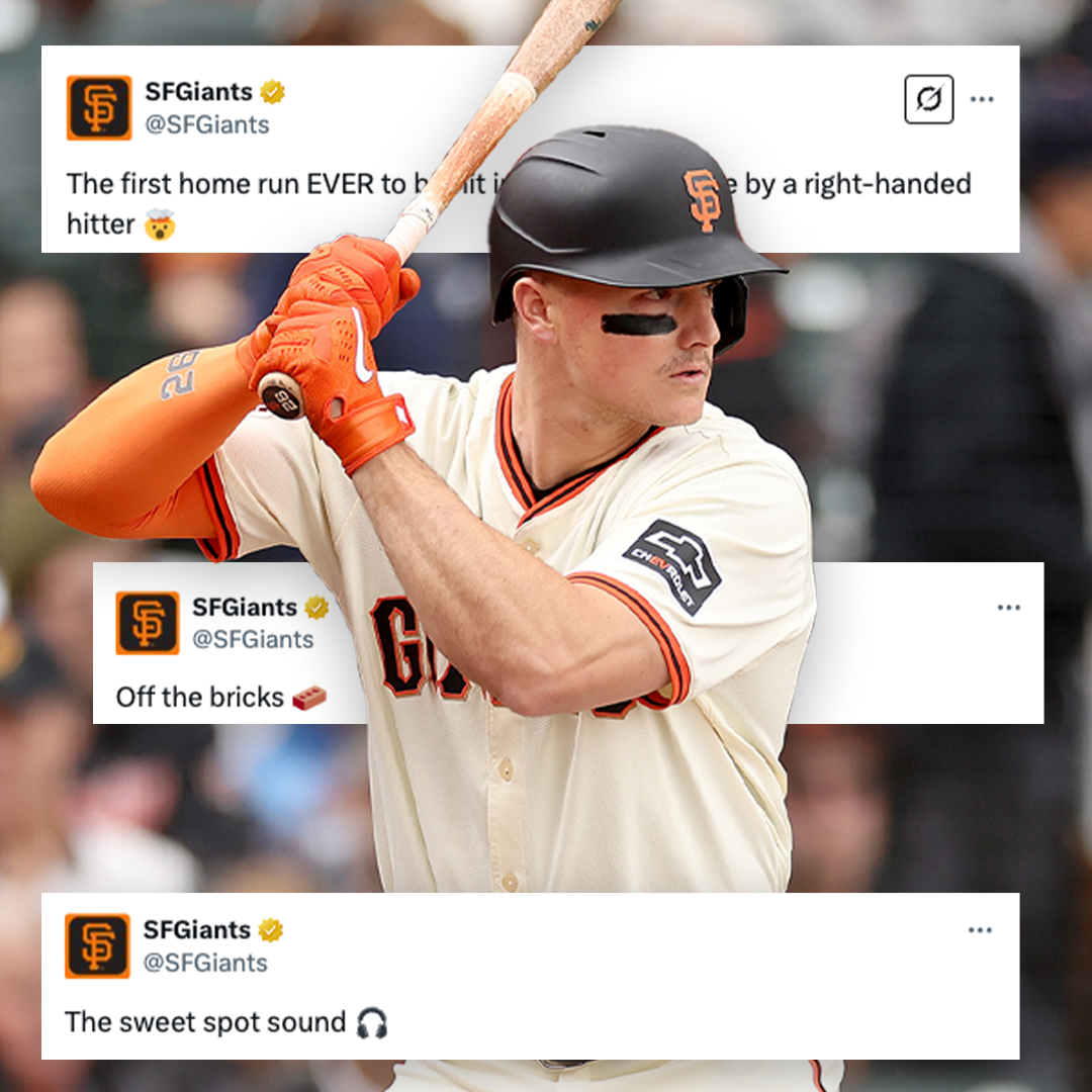
Matt Chapman - Third Base, San Francisco Giants
Blake Snell - Pitcher, San Francisco Giants

J.T. Realmuto - Catcher, Philadelphia Phillies

Justin Herbert - QB, Los Angeles Chargers

Deebo Samuel - WR, San Francisco 49ers

Deebo Samuel is a passionate football player who brings immense energy to the game. To reflect this intensity in the design, I incorporated fire textures alongside a stock image of stadium lights to illuminate Samuel. By adding subtle inner shadows to the front of his jersey, I was able to mitigate the harsh glare from the bright daytime sun when this photo was taken.

Nick Bosa - DE, San Francisco 49ers

While the 49ers were making their Super Bowl run in 2023, I wanted to create my own set of Game Day graphics with the mindset to post along the same cadence as their team of designers. I was especially happy with how the big cutout turned out and learning how to mix in level adjustments to add more shadows and brightness to make Nick Bosa stand out.

Joe Burrow - QB, Cincinnati Bengals

My main focus for this graphic was to practice my cutouts and provide Burrow with a surface to stand on. I wanted to avoid the appearance of him floating. The area where I needed improvement was the larger cutout of Burrow. In its current state, it doesn't fit well in the graphic because there is nothing to shield his upper half. If I were to do it again, applying a simple black gradient would have been able to solve that problem.

Justin Herbert - QB, Los Angeles Chargers

This piece was the first time I started experimenting with different glows and shadows to make the cutouts stand out more on the canvas. On the small Justin Herbert cutout, I incorporated a mixture of gradients, inner glow, and small drop shadows to give him an illuminating presence. Through my experimentation, I learned that a smaller percentage of glow would have allowed more natural colors to appear on him.


Patrick Bailey - Catcher, San Francisco Giants

For this project, my sole focus was to work on gradient mapping, which I identified that needed improvement. The color scheme presented a challenge; however, I managed to make it work. A combination of level adjustments, brightness & contrast, and curves allowed me to elevate the larger cutout from the background.

Casey Schmitt - 3rd Baseman, San Francisco Giants 

For Casey Schmitt’s MLB debut, I aimed to create a graphic that illuminates grittiness while also highlighting San Francisco. Behind Schmitt is a grunge cement texture mixed in with a levels layer that helped elevate the color scheme to a brighter orange. Additionally, I kept in mind that I wanted to incorporate a picture of Market Street in San Francisco. Finally, by applying a subtle curves layer, the image of San Francisco in the background was allowed to show through, creating a special moment for the third baseman.

Patrick Bailey - Catcher, San Francisco Giants

The city by the Bay is where one of the premiere backstops is located. After watching a YouTube video on a similar design, I made my own. I downloaded various free cloud brushes to hide the Golden Gate Bridge in background, however, while still not trying to oversaturate the canvas so it could not be noticed. Bailey was then placed on the Oracle Park infield where I attempted to make the field seem more flat and give it some perspective. 

Christian McCaffrey - RB, San Francisco 49ers

From a creative perspective, minimal static graphics have always caught my attention. I have seen designers use only elements such as text, a cutout, and minimal texture to create a dynamic canvas. To give CMC some depth, I applied a slight inner glow to the text while applying a gradient to give it more of a fading look.

Brock Purdy - QB, San Francisco 49ers

From Mr. Irrelevant to an MVP candidate, Brock Purdy has star potential written all over him. Infusing a mixture of levels, temperatures, gradients, and tape textures led to this dynamic composition. Finally, by applying a camera raw filter, I was able to elevate the shadows on the canvas to make each Brock Purdy cutout more visible and recognizable.

Aaron Rodgers - QB, Green Bay Packers

I created a custom graphic featuring Packers legend Aaron Rodgers. I wanted to create a gritty visual to match Rodgers’ playstyle. Leaning into the Packers' green and gold color scheme, I wanted to make a composition that allowed Rodgers to stand out and drive the viewer's attention to the three cutouts. ​​​​​​​

You may also like

Back to Top